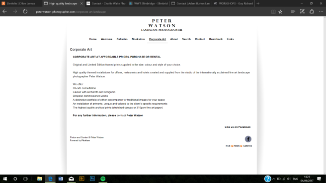
I began viewing other photographers websites in the similar field to which my work fits in to, which i see as landscape/photojournalism. I came across Peter Watson, and i found as son as i went on to his site the logo stood out to me. The site is very minimalist in black and white, which makes the bold caps stand out against the white banner. He uses a large space in-between the letters to make the area it covers bigger, and as we do not usually view words like this it captures the viewers eye.
I also like the simple category’s at the top of the page, which makes it easy to navigate around the site and pick what you want to see.